
Expert Tips for Seamlessly Coordinating Wall Colors and Furnishings
Deciding on wall colors for any room can feel overwhelming with so many paint options. And it gets even trickier when trying to select hues that coordinate beautifully with your existing furniture, flooring, and decor elements. Where do you start? Follow this comprehensive guide on expert techniques for mixing and matching paint colors with home furnishings so that you make color combo choices you love.
Understand Color Theory Basics
Before attacking any paint project, first, brush up on some basic color theory to understand how colors interact together visually on the color wheel. The color wheel displays every shade imaginable in its tone and intensity. Important for coordinating paint and decor combinations are:
· Primary Colors - Red, Blue, Yellow (can’t mix these colors)
· Secondary Colors - Green, Orange, Purple (mix two primaries)
· Tertiary Colors - Red-Orange, Yellow Green (mix secondary and primary)
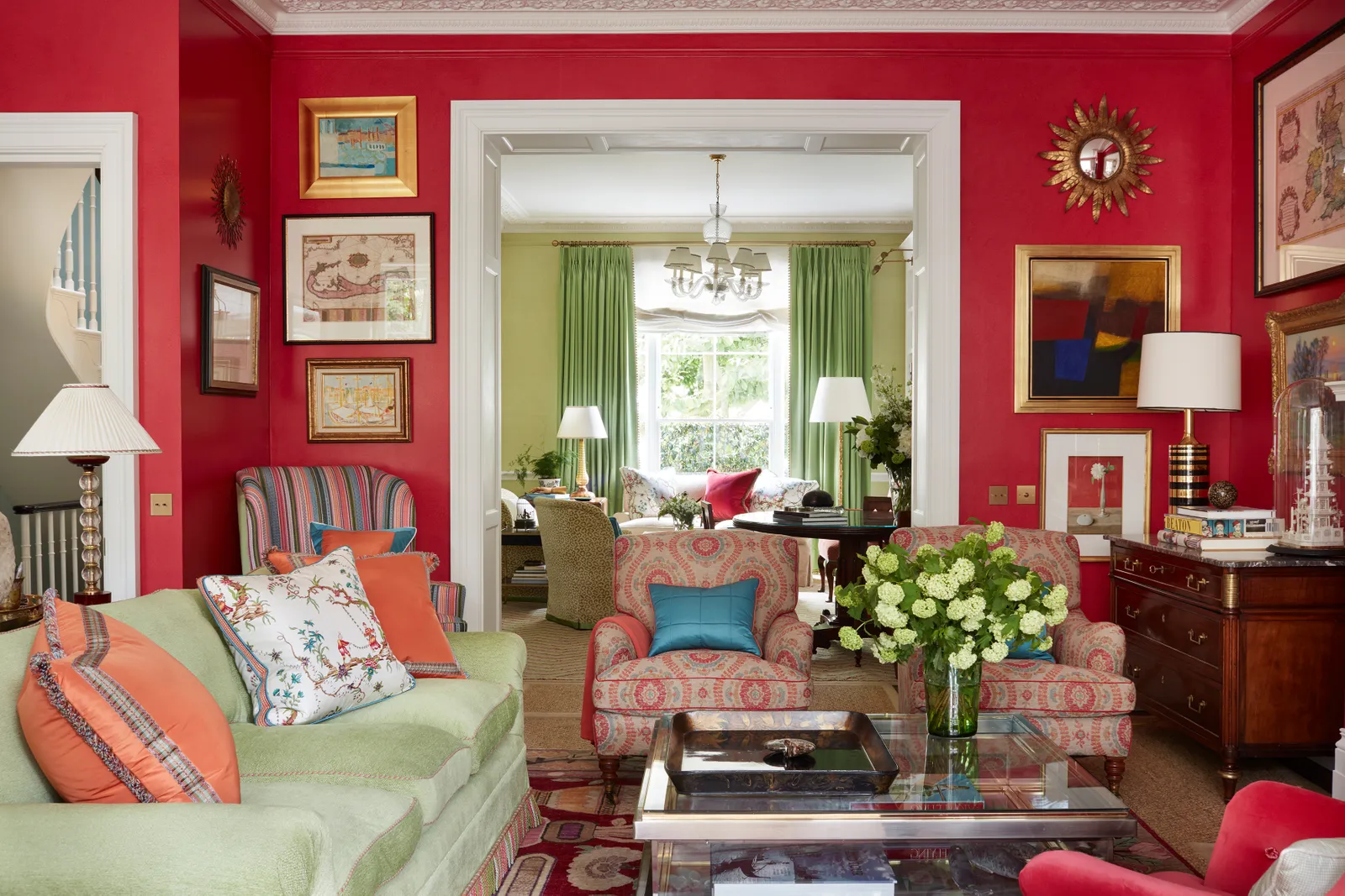
· Complementary Colors - Located opposite each other on the wheel (red & green)
· Analogous Colors - Next to each other on the wheel (blue, blue-violet)
· Monochromatic - All one-color family (light to dark blue)
Use this color science to identify hues that naturally coordinate in pleasant ways. It guides you in blending both harmonious and vibrant palettes.
Gather Inspiration from Decor Items First
Walk your home with fresh eyes, cataloging the color palette hiding within existing furnishings, window treatments, artwork, and decorative elements. Identifying these color clues first makes matching new wall paint colors much easier. Some detective work items:
· Rugs and Throws - Border stripes or patterns often provide perfect accent colors to build a palette around. Snap photos of their colors to take paint shopping.
· Furniture Woods - Match brown paint tones to closely resemble the natural wood finishes used on furnishings in the room. Golden oak floors, for example, would coordinate well with creamy beige or tan wall colors.
· Countertops/Cabinets - For kitchens and baths, select wall hues that share undertones with surfaces like granite, tile, or stone backsplashes so the elements tie together nicely.
· Artwork Frames - Scan framed photos and art prints hanging in the room for stained wood, metallic finishes, or bordering mat colors to inspire coordinating wall shades.
· Pillows and Curtains - Pull out accent colors and patterns used on fabric window treatments, pillows, curtains, or cushion trims as the jumping point for a wall color scheme.
Once you spot pleasing colors worth building around, gather actual decor swatches or digital color samples to bring to the paint store. Let the chips and swatches guide each paint selection decision as you move through the store so that new hues blend beautifully with treasured home decor items.
Consider Lighting's Impact on Paint Color Perception
Keep in mind that lighting plays a pivotal role in how we perceive colors in a space. Natural daylight often makes rooms appear brighter and cooler-toned. Soft lamp lights seen at night lend extra saturation and a warmer ambiance. Paint chip colors viewed under the lighting conditions of your actual room help curb disappointment from colors appearing different once they're on the wall. Here are some useful tips on lighting adaptability:
· North Lighting - North-facing rooms with indirect northern light need bolder, warmer paint colors (yellows, peaches) so the walls don't read washed out and bare.
· South Lighting - South-facing spaces with tons of direct sunlight can handle cooler paint shades (blues, greens) without appearing too intense and overwhelming.
· Dark Rooms - For bedrooms and basements, test paint chips at night to ensure the tones don't get too dark. Throw extra lamps around the sample to judge accurately.
Paint Bolder in Small Spaces for Balance
When dealing with narrow hallways or tiny rooms and baths, resist choosing only light and pale neutrals which can make them feel sterile and neglected. Instead, inject personality by painting one or two walls in slightly bolder jewel-toned shades. The deeper colors give the illusion the space is larger than it is while lifting the style quotient to feel cozy instead of claustrophobic. Just stick to semi or low sheens so the dark shades don't appear too intense.
Create Flow with Whole-Home Color Schemes
To establish greater design harmony between rooms, adopt a consistent wall color palette plan used throughout common living areas. Tie spaces together through hallways and entry points by sticking to one core neutral shade as the main wall color. Then layer in bolder accent walls, artwork, and decor items unique to each room styling. Use color psychology to balance energetic tones and mellow hues appropriately from room to room.
Compare Paint Chips to Your Fabric Swatches
Fabrics have unique properties where hues often appear differently depending on the material texture, sheen, and weave type used - aspects of paint chips don't convey well. When attempting to color coordinate paint to match decor items, compare swatches side by side under the same lighting before choosing matching chips at the store. For shear fabrics, opt for darker paint shades so colors appear saturated on the wall. With heavy textiles like chenille or fleece, stick to lighter or brighter paint versions of the color seen in the weave.
Coordinate Paint with Architectural Characteristics
A room's permanent physical details like crown molding, baseboards, ceiling trim, and antique stained features establish fixed design elements Wall colors must play nicely with long term. For Victorian-era homes, stick to historical ambient colors in softer pastel strengths that show off detailed architecture without competing with its beauty. Or lean brighter and bolder with modern minimalist dwellings to visually expand pared-down, blank rooms needing personality. Evaluate architectural factors unique to your home before selecting any wall shades.
Tips for Pairing Paint Colors with Wood Furnishings
When attempting to coordinate wall paint colors with a room full of wood-toned furnishings like pine bed frames, oak cabinets, and walnut end tables, stick to creams and beiges paired with woodsy mid-tone browns for a cohesive natural look. Stay away from going too light or dark on main wall colors. For wood-heavy spaces like dens and studies, consider lighter sage greens that exude the peaceful outdoorsy feel of nature. Accent walls behind shelving pop nicely in forest greens and navy blues as well without clashing.
Guidelines for Matching Kitchen & Bath Paint to Cabinets
Kitchens and baths require extra care when matching wall paints to existing cabinetry and countertops, so these high-use spaces maintain a streamlined, pulled-together aesthetic. As a rule of thumb:
· If cabinets read warm (cherry, walnut) stick to warm paints like tans, browns, peach, gold, or yellow.
· For cool cabinetry (maple silver gray) accent with cool blues, grays, and greens.
· Always pick a lighter wall color than a cabinet finish so cabinets stand out.
· Monitor how natural light impacts tones at different times of day.
By tweaking wall hue warmth and strengths based on permanent wood choices in these rooms, your eye perceives intentional, pleasing alignment instead of clashing disconnected elements.
Conclusion
Coordinating the perfect wall color with existing furnishings may seem challenging at first. But armed with the right knowledge of lighting adaptability, architectural elements, color theory, and psychology, you can learn to create balanced, pleasant palettes tailored to both room function and mood. Carefully considering how colors interact visually ensures your paint selections promote harmony instead of chaos within your well-decorated home.